+Subscribe
Electronic subscription document technology platform for alternative investments.
+SUBSCRIBE is a leading enterprise software solution providing electronic subscription document technology and lifecycle management platform for alternative investments. We partnered with +SUBSCRIBE to create the new branding, marketing materials, website and product UI/UX for their launch. The platform allows allocators, sponsors, and service providers to digitize the entire onboarding, investment, and reporting process for alternative investments, dramatically increasing efficiency and improving the experience.
Visit the +Subscribe websiteHow We Helped
Product Design
UI/UX
Brand Identity
Logo Design
Product Strategy
Website Design
Illustration
Marketing Materials
Founders
Rafay Farooqui
Investors
Confidential


The Branding Foundation
+Subscribe's brand is built on a foundation of digitization, moving from analog to digital. The most important action in the process of analog or digital alternative investments is subscribing. This action became the driving force behind the name, branding concepts as well as SaaS platform UI/UX decisions. The plus was added to the name Subscribe during the branding process, when proposing future brand expression and applications of a particular logo design featuring a plus icon.

Creating an Electronic Subscription Product Brand
This + mark generally symbolized addition, in this case adding an alternative investment. However, this symbol and meaning isn't unique to Subscribe when it comes to subscriptions, so it alone was not sufficient from our perspective when building the brand value and story as it connects to the brand identity. After exploring various ways of extracting the core mission, values, technologies and processes to infuse the + icon, we determined that there are a few core value concepts that we would introduce; cohesive product, complicated technology and portfolio of investments. The visual identity concepts for each of these became
- Unified and/or symmetrical icon for cohesive product
- Many synchronized elements for complicated technology
- Visuals that symbolize individual investments

Cohesive and Symmetrical Logo
Our solution was a + mark that represents +Subscribe as a whole that is composed of individual + marks representing the alternative investment portfolio, all of which is organized into a single, cohesive, symmetrical icon. At a small enough scale the icon becomes a single plus, but at medium to larger scales can become the primary, multiple plus mark. This creates a unique flexibility in logo design that doesn't just achieve scalability for print and digital applications, but also creates flexibility within scalability. The simple, bold wordmark for Subscribe, which uses a modern and approachable font, compliments the lighter, open, flexible + icon to create a cohesive logo mark where each element can work independently or together.


Fintech Identity and Design Assets
Once the core brand strategy and concepts were established, we explored digital expression, illustration style and a sophisticated identity system in more depth. Our goal was to make the brand identity appear as light and easy to use as the actual platform. We used a very soft and light color palette, complemented by a palette of brighter brand colors to be used for select purposes.
+Subscribe lives within the world of Fintech as well as a more traditional industry with standard analog processes, so our identity system is designed to communicate effectively to both general audiences. Gradients and drop shadows are used throughout the brand identity system, including in the website platform style guides, in order to subtly communicate that the product involves efficient technology and a space for making your life easier.
Extensive Icon and Illustration Package
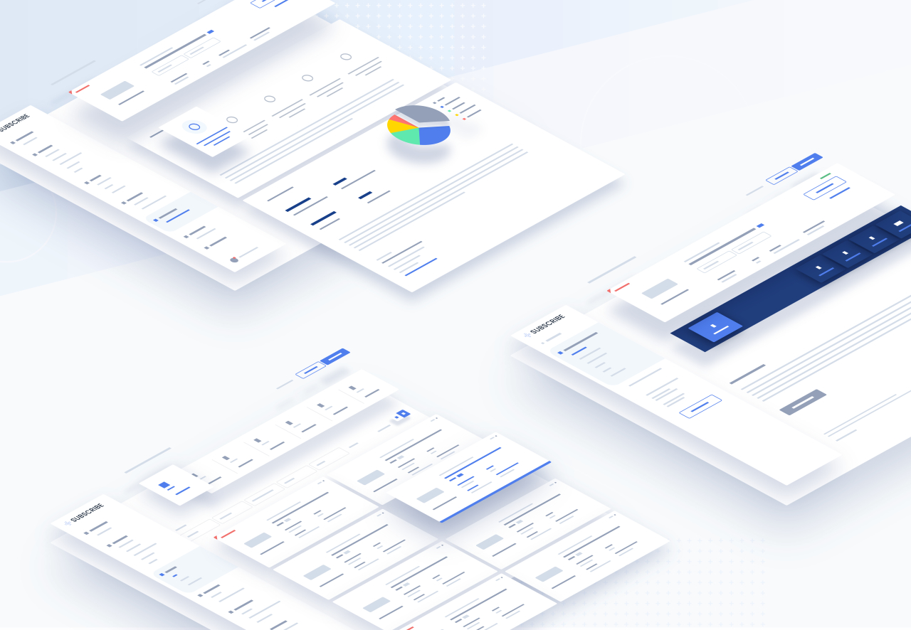
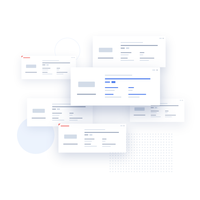
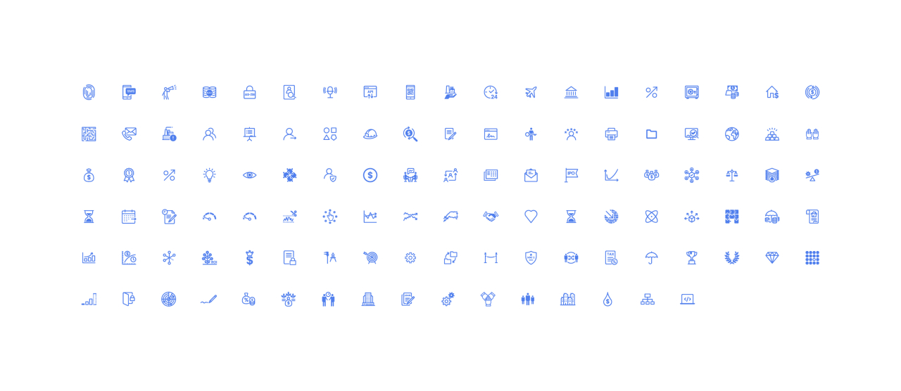
Our design team produced a series of illustrations to communicate the product features and benefits as well as a complete set of icons to be used on the platform and website. These branded assets add another level of depth to the communication system established in the branding process. These designs don't display the detailed product screens or reveal the technology behind it, but rather simplify into a graphic illustration style that gives a high level overview for potential customers to understand.
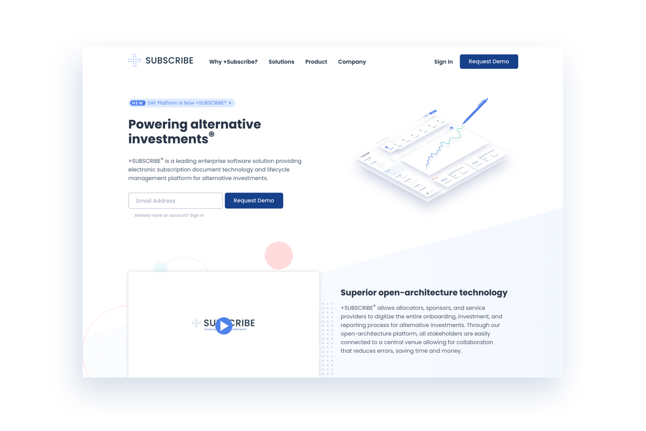
The Marketing Website Design
The website design, like other marketing materials, was created using the established brand identity system. As with each unique asset design, we approach the application of branding differently. A website, a SaaS platform and printed marketing collateral almost never use the exact same system, but they'll use variations of an overarching system that can adjust based on unique conditions and best practices.
The website is designed to communicate the product benefits, who it's for and the features that make this happen. The main goal and focus of this particular website is conversions - to drive potential users of +Subscribe to reach out, sign up and become a paying customer.
Product Design
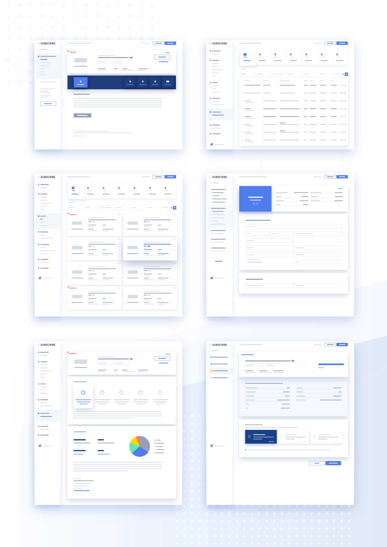
Our approach to the +Subscribe product redesign was to improve both the overall user experience and to update the entire user interface to be in line with the new branding. We redesigned the core structure of the platform and iterated weekly with the +Subscribe team to ensure that the product achieved all company goals. The project started out being simply an interface update, but when found opportunities for making significant alterations and improvements to the structure, flow and features, it became a much bigger, all-encompassing product overhaul.
